画个热力图
1 | import numpy as np |

热力图美化
修改图例范围
参数:
vmin,vmax1
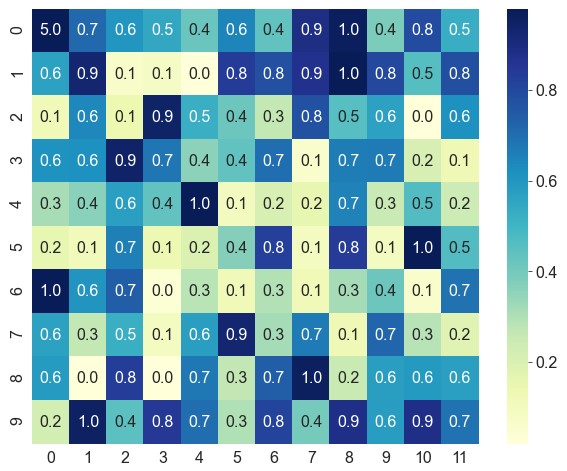
ax = sns.heatmap(data=data, vmin=0, vmax=1)

参数:
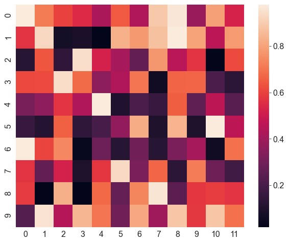
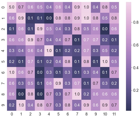
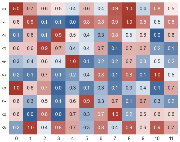
robust。如果不设置vmin和vmax,且robust设为True,图例将忽略极值按照鲁棒的四分位进行计算1
2data[0, 0] = 5 # 将其中一个数据改成极大的异常值
ax = sns.heatmap(data=data, robust=True)
左上角数据颜色发生了变化,图例并没有受到影响
添加数据标注
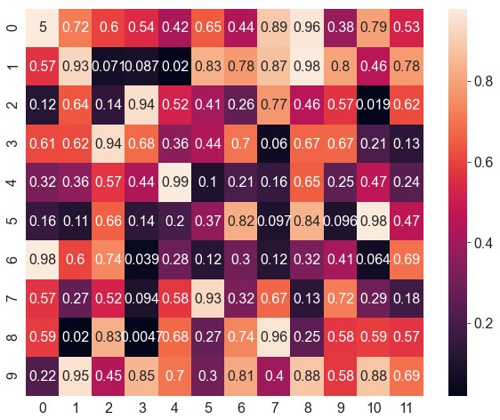
参数:
annot。设为True即显示原始数据,也可以设为与原始数据形状相同的数据矩阵1
ax = sns.heatmap(data=data, robust=True, annot=True)
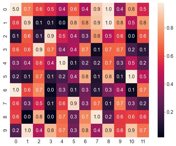
参数:
fmt1
ax = sns.heatmap(data=data, robust=True, annot=True, fmt='.1f') # 保留1位小数
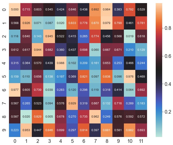
参数:
annot_kws。可修改matplotlib.axes.Axes.text()其它相关参数1
ax = sns.heatmap(data=data, robust=True, annot=True, fmt='.3f', annot_kws={'size': 10}) # 修改数据标注的字体大小

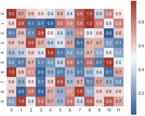
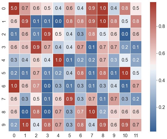
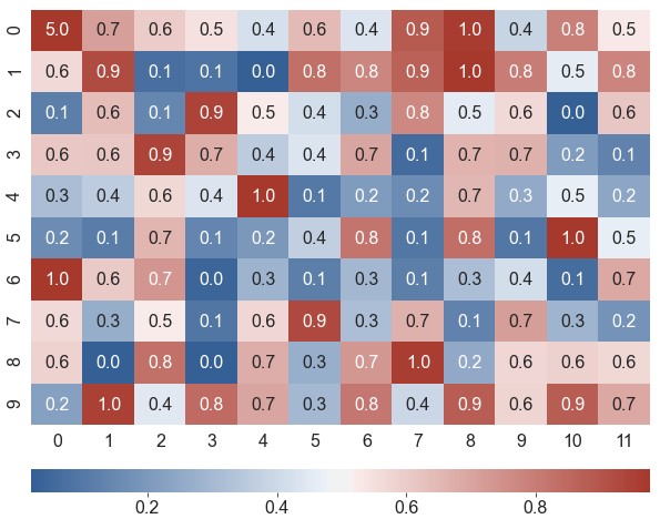
修改配色
参数:
center。设置渐变色的中间数值1
ax = sns.heatmap(data=data, robust=True, annot=True, fmt='.3f', annot_kws={'size': 10}, center=0.5)
参数:
cmap。取值是matplotlib包里的colormap名称或颜色对象,或者表示颜色的列表1
ax = sns.heatmap(data=data, robust=True, annot=True, fmt='.1f', cmap='YlGnBu')
使用
sns.cubehelix_palette生成自定义配色1
2cmap = sns.cubehelix_palette(start=2.8, rot=0.3, gamma=0.8, reverse=True, as_cmap=True)
ax = sns.heatmap(data=data, robust=True, annot=True, fmt='.1f', cmap=cmap)使用
sns.diverging_palette生成自定义颜色1
2cmap = sns.diverging_palette(h_neg=250, h_pos=15, s=75, l=40, center='light', as_cmap=True)
ax = sns.heatmap(data=data, robust=True, annot=True, fmt='.1f', cmap=cmap)

形状、边框、图例、标签
形状参数:
square。如果设为True,则每个色块都为正方形1
ax = sns.heatmap(data=data, robust=True, annot=True, fmt='.1f', cmap=cmap, square=True)
边框参数:
linewidths,控制边框线的粗细;linecolor,控制边框线的颜色1
ax = sns.heatmap(data=data, robust=True, annot=True, fmt='.1f', cmap=cmap, linewidths=0.2, linecolor='white')
图例参数:
cbar。若设为False,则不绘制图例1
ax = sns.heatmap(data=data, robust=True, annot=True, fmt='.1f', cmap=cmap, cbar=False)
图例横放:
cbar_ax,cbar_kws1
2
3grid_kws = {'height_ratios': (0.9, 0.05), 'hspace': 0.2}
f, (ax, cbar_ax) = plt.subplots(2, gridspec_kw=grid_kws)
ax = sns.heatmap(data=data, robust=True, annot=True, fmt='.1f', cmap=cmap, ax=ax, cbar_ax=cbar_ax, cbar_kws={'orientation': 'horizontal'})标签参数:
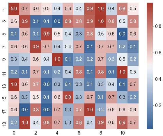
xticklabels,yticklabels。如果设为True,将列名设为标签;如果设为False,则不绘制标签。可指定一个列表作为标签;也可设为一个整数n,表示每n列绘制一个标签1
ax = sns.heatmap(data=data, robust=True, annot=True, fmt='.1f', cmap=cmap, xticklabels=2, yticklabels=range(1, 21, 2))
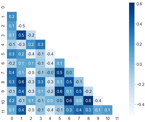
去除上三角
1 | df = pd.DataFrame(data).corr() # 计算特征相关性 |
相关性热力图的对角线上全部为1,左下三角和右上三角是对称的,可以去除上三角,避免信息冗余
参数:
mask1
2
3mask = np.zeros_like(df) # 创建一个与数据形状一致的类零矩阵
mask[np.triu_indices_from(mask)] = True # 获取类零矩阵上三角的索引,将这部分数据设为True
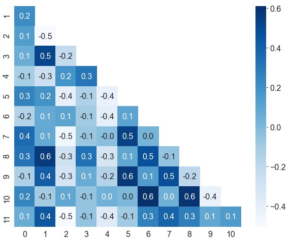
ax = sns.heatmap(data=df, cmap='Blues', annot=True, fmt='.1f', mask=mask)去除边缘空白
1
2mask = mask[1:, :-1]
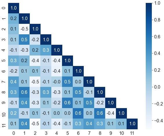
ax = sns.heatmap(data=df.iloc[1:, :-1], cmap='Blues', annot=True, fmt='.1f', mask=mask)保留对角线
1
2
3mask = np.ones_like(df)
mask[np.tril_indices_from(mask)] = False
ax = sns.heatmap(data=df, cmap='Blues', annot=True, fmt='.1f', mask=mask)
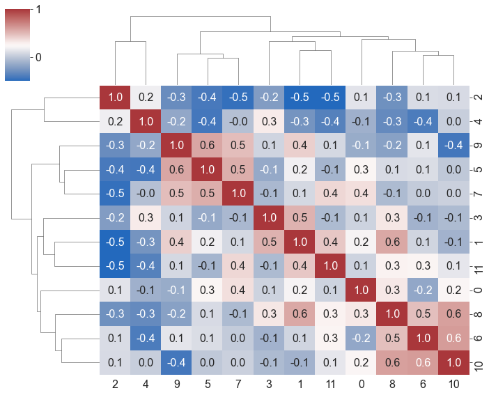
聚类热力图
输入宽数据
1
ax = sns.clustermap(df, robust=True, annot=True, fmt='.1f', cmap='vlag', figsize=(10, 8))
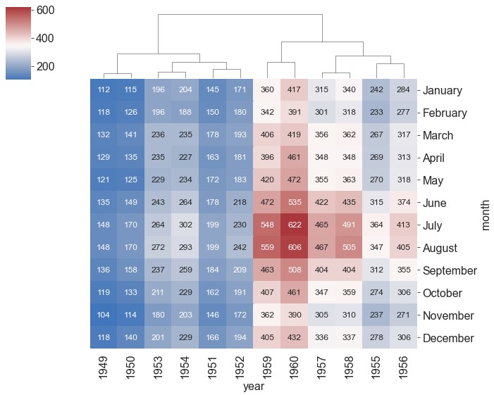
输入长数据
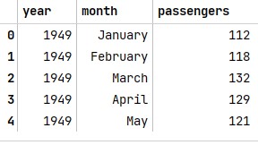
1
2flights = sns.load_dataset('flights')
flights.head()1
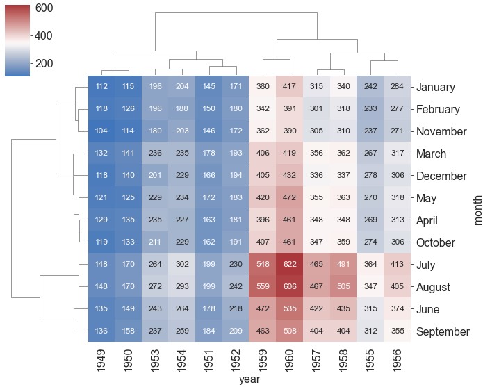
ax = sns.clustermap(data=flights, pivot_kws={'index': 'month', 'columns': 'year', 'values': 'passengers'}, figsize=(10, 8), cmap='vlag', center=350, annot=True, fmt='d', annot_kws={'size': 12})
借助
pivot_kws参数将数据转化为行名为month,列名为year,数据为passengers的透视表
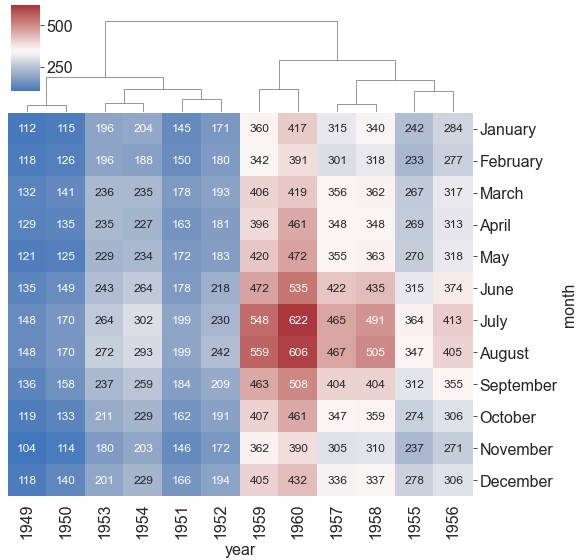
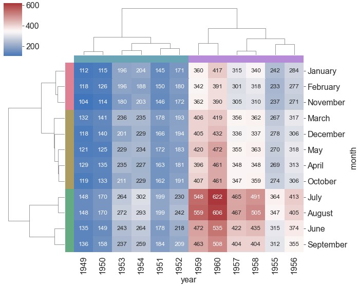
添加分组色条:
{row,col}_colors1
2
3
4
5pal = sns.husl_palette(5, h=0.6, s=0.6) # 根据聚类情况,产生5种颜色代表聚类产生的各个簇
col_pal = [pal[0]] * 6 + [pal[1]] * 6 # 设置按列聚类的颜色列表,这里的顺序是原始数据的顺序,不是聚类后的顺序
row_pal = [pal[2]] * 2 + [pal[3]] * 3 + [pal[4]] * 4 + [pal[3]] + [pal[2]] + [pal[3]] # 设置按行聚类的颜色列表,这里的顺序是原始数据的顺序,不是聚类后的顺序
ax = sns.clustermap(data=flights, pivot_kws={'index': 'month', 'columns': 'year', 'values': 'passengers'}, figsize=(10, 8), cmap='vlag', center=350, annot=True, fmt='d', annot_kws={'size': 12}, col_colors=col_pal, row_colors=row_pal)
聚类参数
method。聚类算法,可选'single','complete','weighted','centroid','median',默认'average'metric。计算簇之间距离的算法,可选'braycurtis','canberra','chebyshev','cityblock','correlation','cosine','dice','hamming','jaccard','jensenshannon','kulsinski','mahalanobis','matching','minkowski','rogerstanimoto','russellrao','seuclidean','sokalmichener','sokalsneath','sqeuclidean','yule',默认'euclidean'z_score。如果设为0,对每一行计算z_score;如果设为1,则对每一列计算z_score,默认为Nonestandard_scale。如果设为0,对每一行进行min-max标准化;如果设为1,则对每一列进行min-max标准化,默认为None{row,col}_linkage。可以提供预先计算好的聚类矩阵
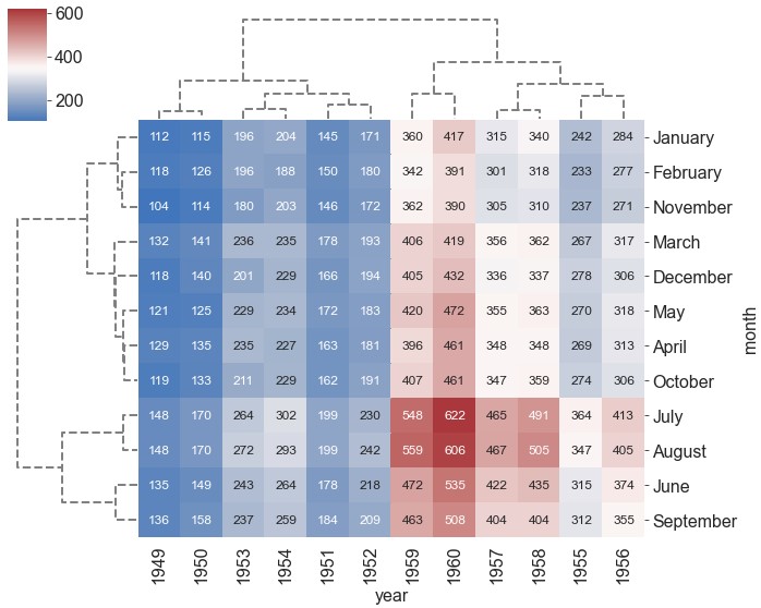
聚类美化
{row,col}_cluster。是否对行、列进行聚类1
ax = sns.clustermap(data=flights, pivot_kws={'index': 'month', 'columns': 'year', 'values': 'passengers'}, figsize=(10, 8), cmap='vlag', center=350, annot=True, fmt='d', annot_kws={'size': 12}, row_cluster=False) # 不对行进行聚类
图例位置:
cbar_pos1
ax = sns.clustermap(data=flights, pivot_kws={'index': 'month', 'columns': 'year', 'values': 'passengers'}, figsize=(10, 8), cmap='vlag', center=350, annot=True, fmt='d', annot_kws={'size': 12}, row_cluster=False, cbar_pos=(0.19, 0.84, 0.04, 0.15)) # (left, bottom, width, height)
tree_kws1
ax = sns.clustermap(data=flights, pivot_kws={'index': 'month', 'columns': 'year', 'values': 'passengers'}, figsize=(10, 8), cmap='vlag', center=350, annot=True, fmt='d', annot_kws={'size': 12}, tree_kws={'linestyles': 'dashed', 'color': 'grey', 'linewidths': 2})